FrontEnd
Fronted Section is the place where you will arrange your search page. If you don't know how to have a Search page please check our Reactive Builder Section, you will have a Search page like below in the frontend section,
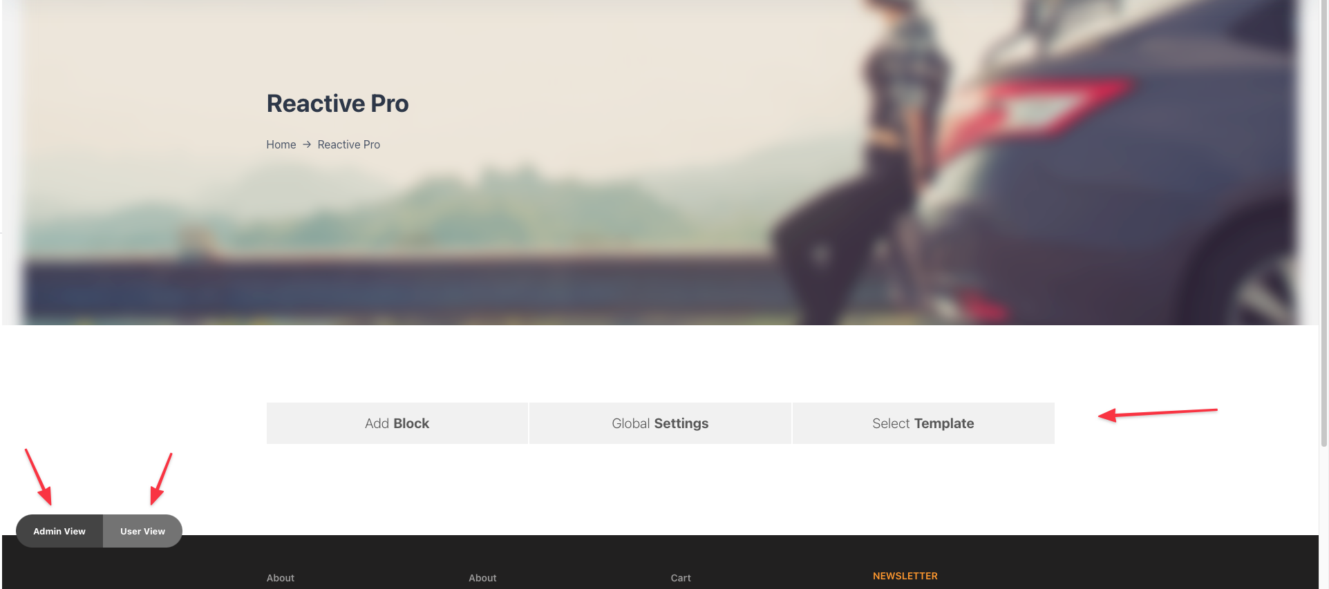
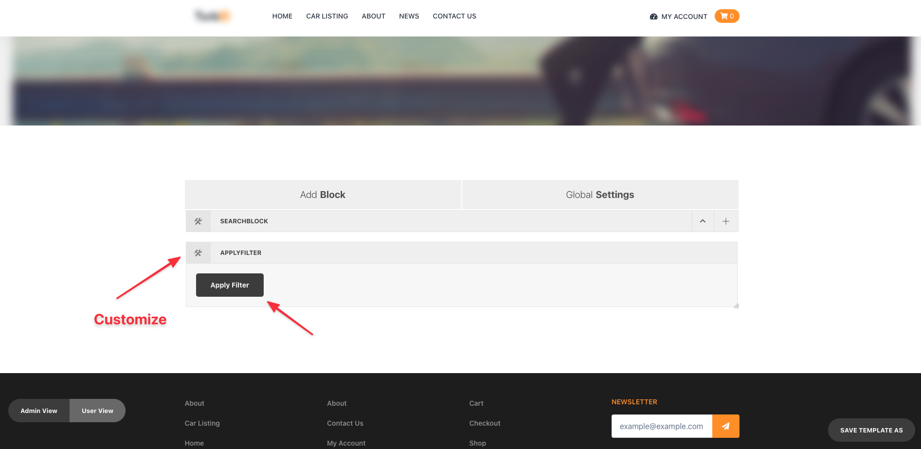
If you have successfully find the above image on your search page then you can follow the below steps otherwise please check the previous section again,
Here, we can see 4 options in the above image, that is,
- Add Block
- Global Settings
- Admin View
- User View
Add Block:
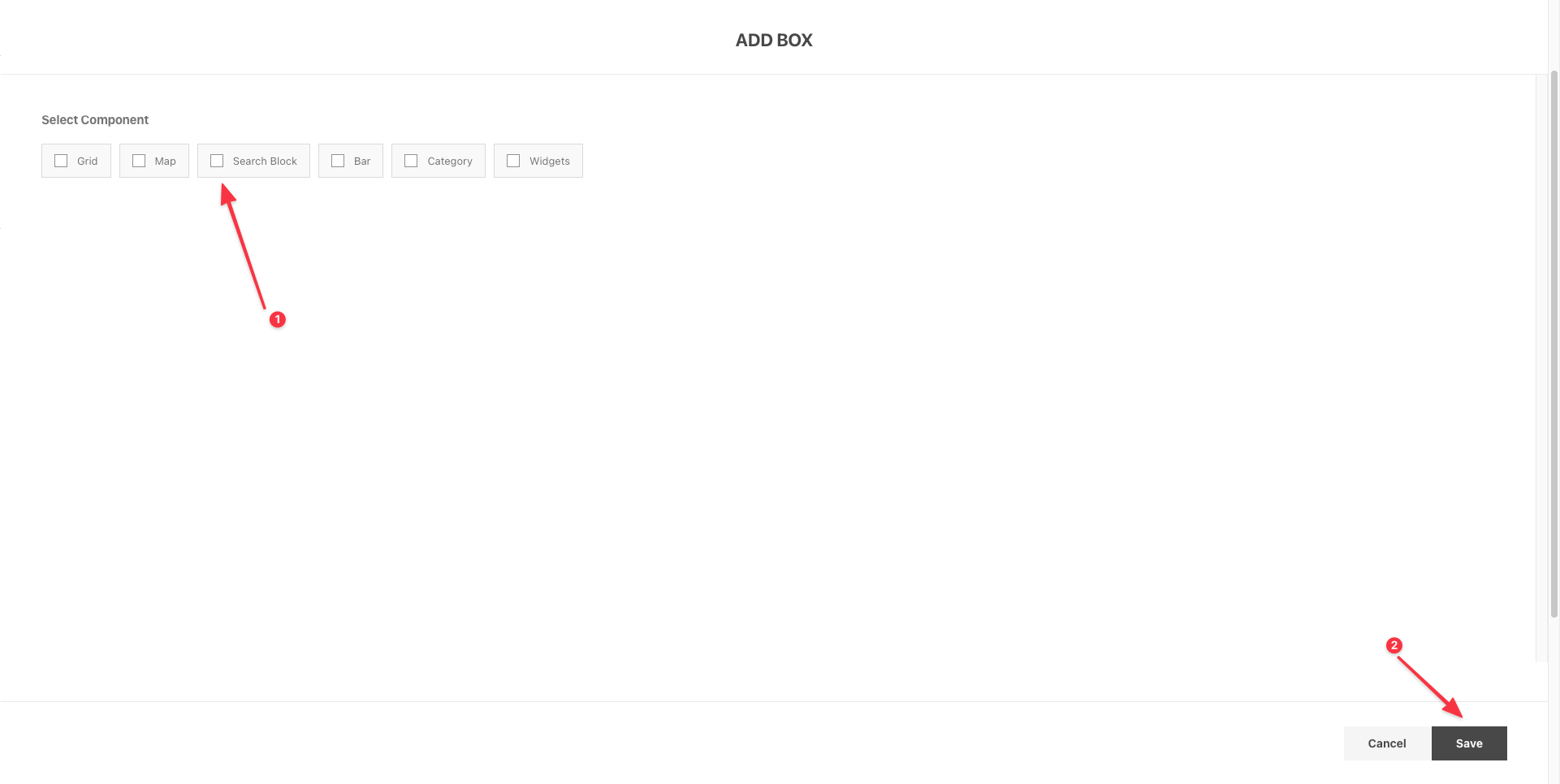
Add Block is the section from where you can add several options to your page layout, the options that you can add from Add block are
- Grid
- Map
- Search Block
- Bar
- Category
- Widgets
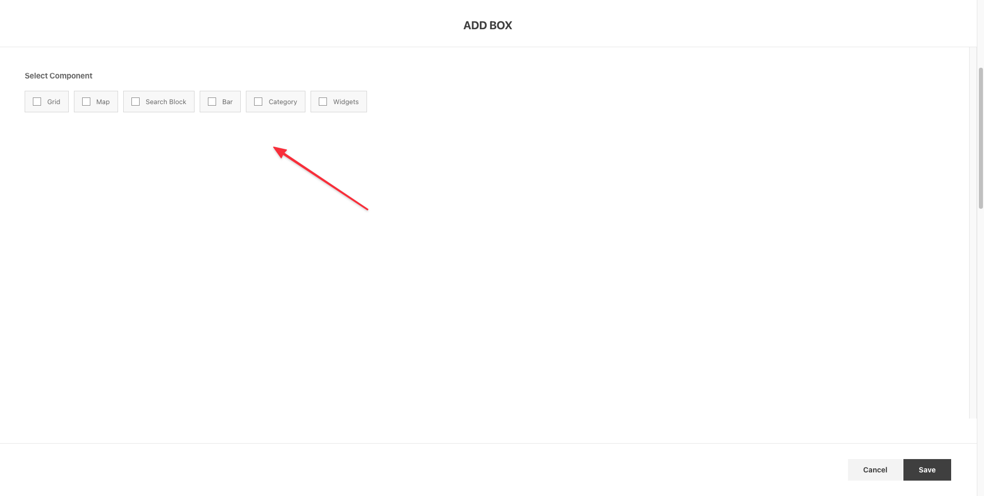
select, any of them you need and then click the save button. To know what you have to do after adding them on your page check the below sections.
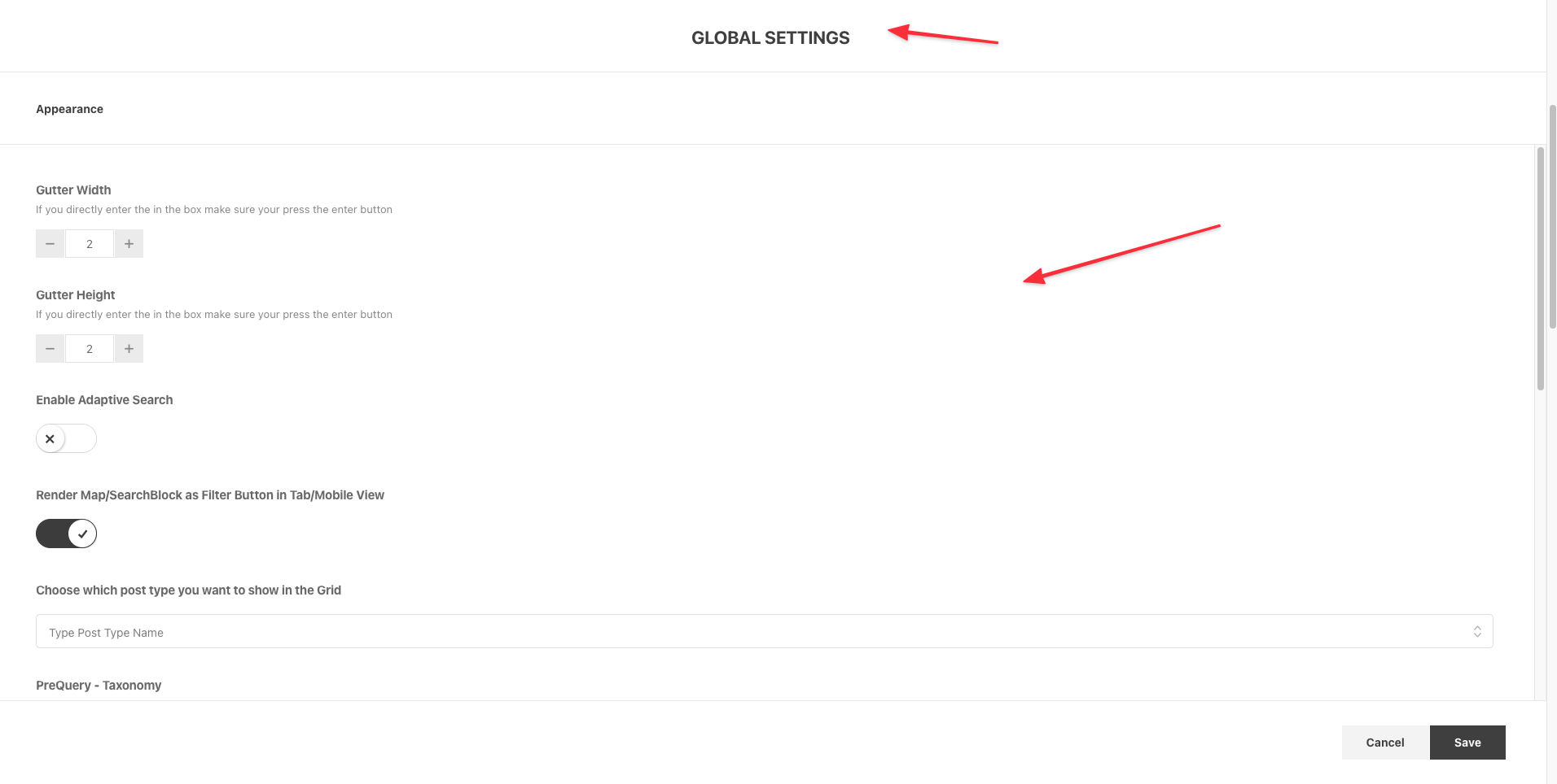
Global Settings:
From Global Settings you can apply Pre filtering, Sorting by Post Title, Date, Meta in Ascending or Descending order. That means your page will be Pre Filtered when the page loads.
Here, you can Enable Adaptive Search or Intelligent Search Also here you can turn on specific Filter button for Mobile or Tab view.
Admin View:
Admin view lets you edit, drag N drop, resize the layouts.
User View:
User view gives a quick view how your edited layout should look in User mood.
Search Block
Search block Allows you to add Search Section in your layout, you can add multiple search block in a page and organize it as you want. it gives you so much flexibility.
Here, we will check what kind of feature & attributes are available in the Search Block.
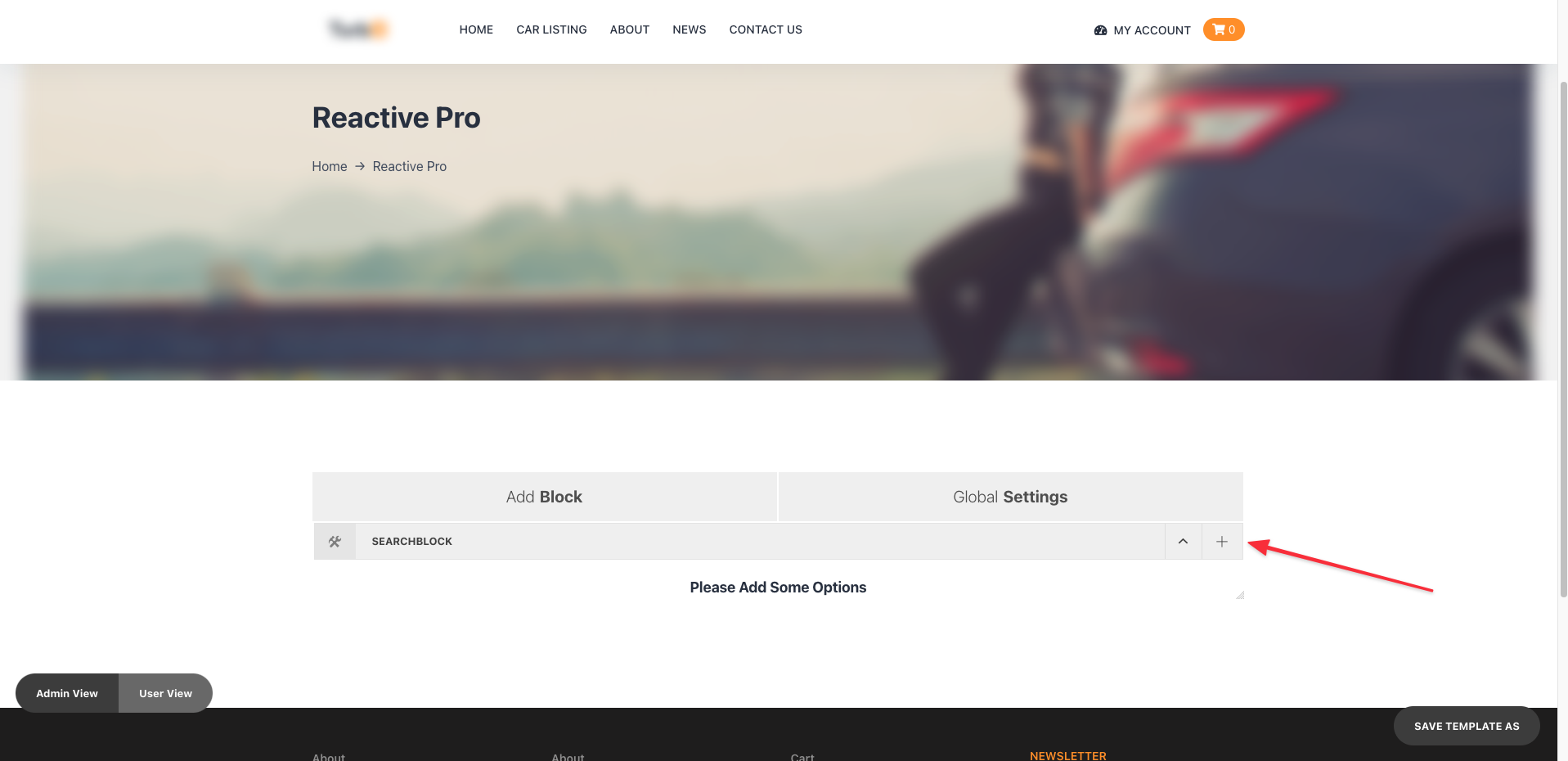
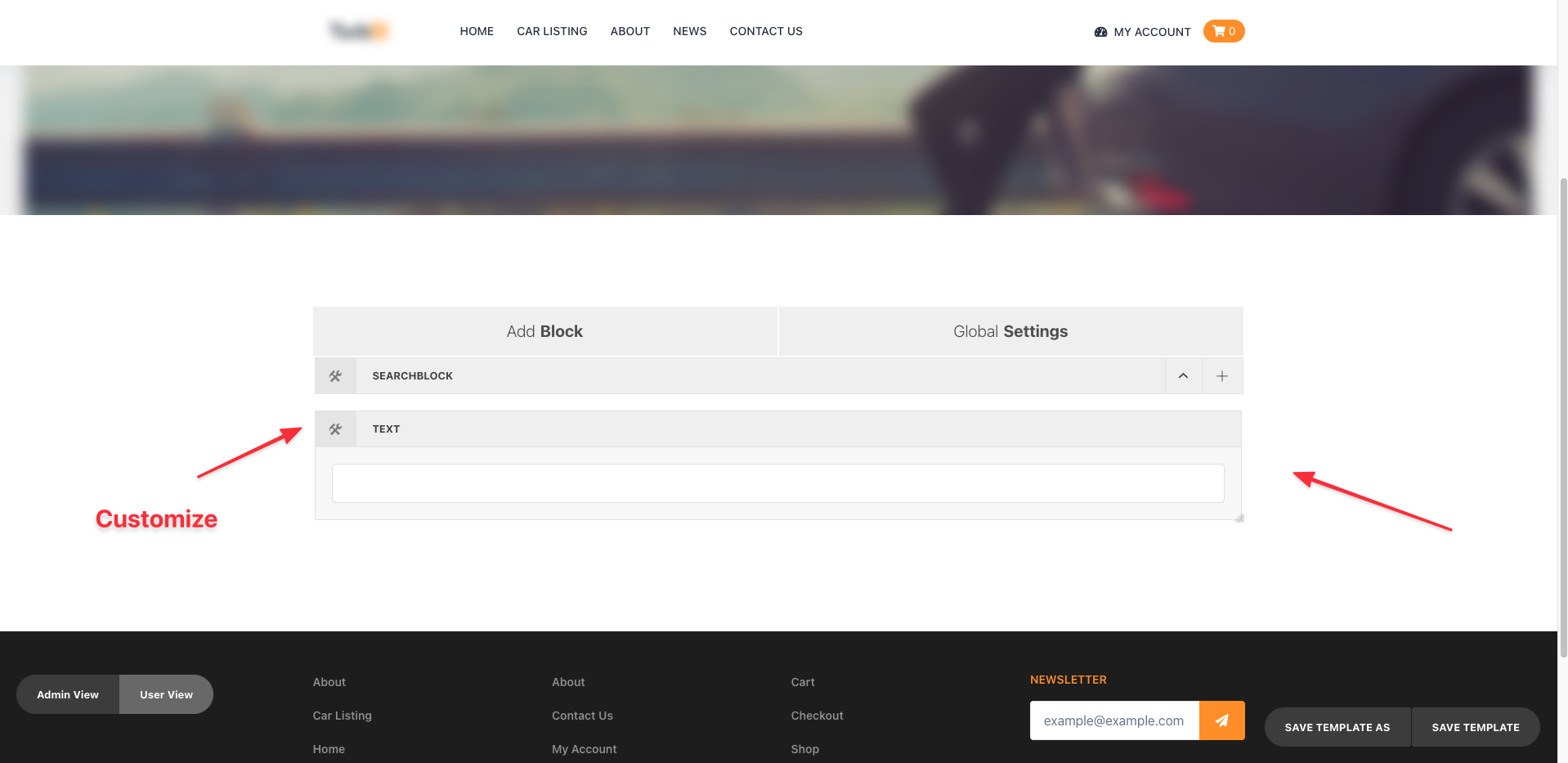
First, let me show you how to add a Search Block,
Click on the Add Block -> Choose Search Block -> Click on the Save Button At the Lower Right Corner
And with that, you'll get all the options to use for the search block.
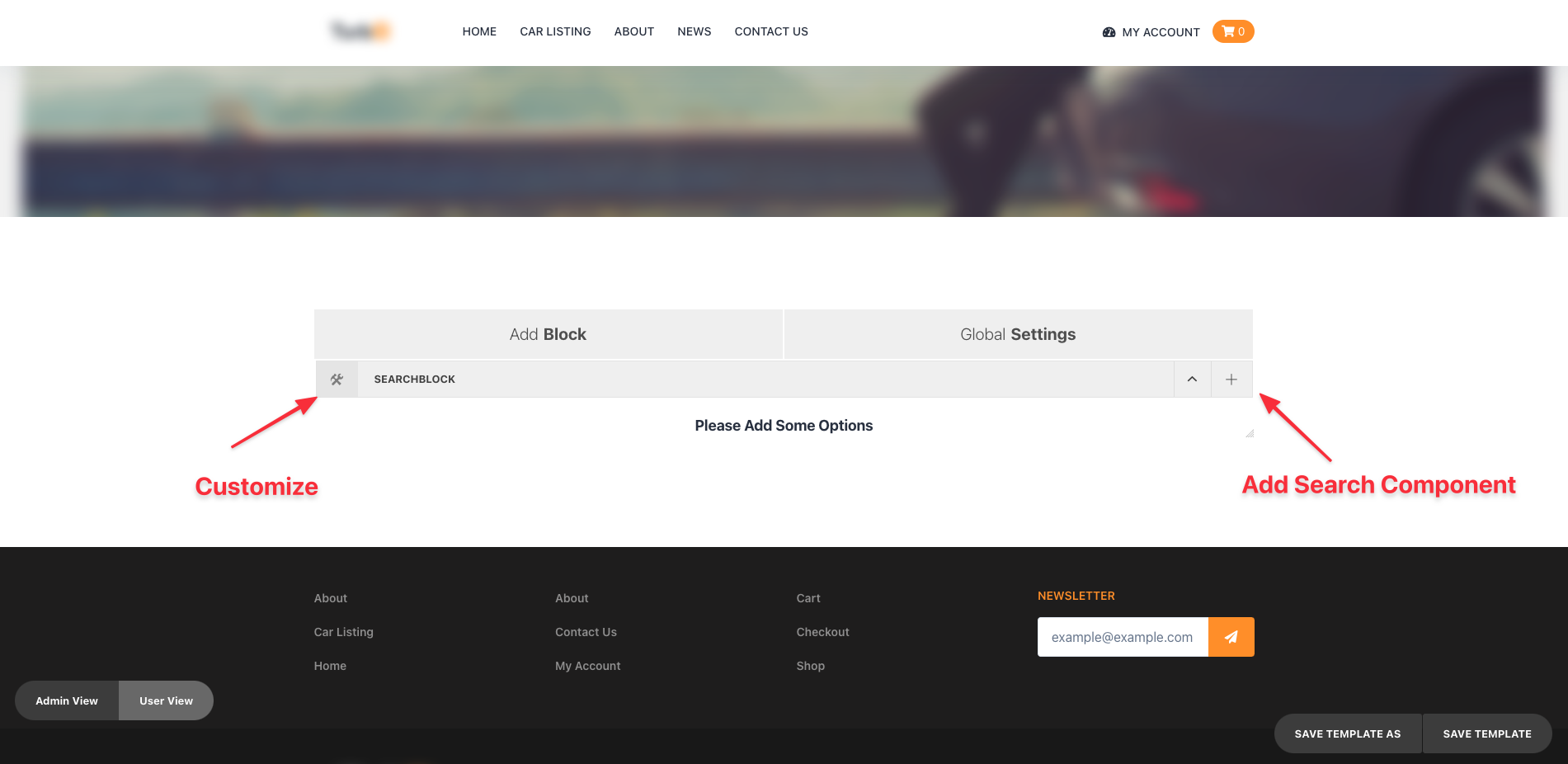
If you click on the top left corner icon, you will find some option like custom class name, block title, place in other search block(to know more about it check the more filter section) etc.
Theres a Collapsed icon it give you the ability to open and close the search block with its component in it, it is helpfull to drag n drop layout.
The plus icon allows you to add search component in your search block. we have 15 different search component available in our search block.
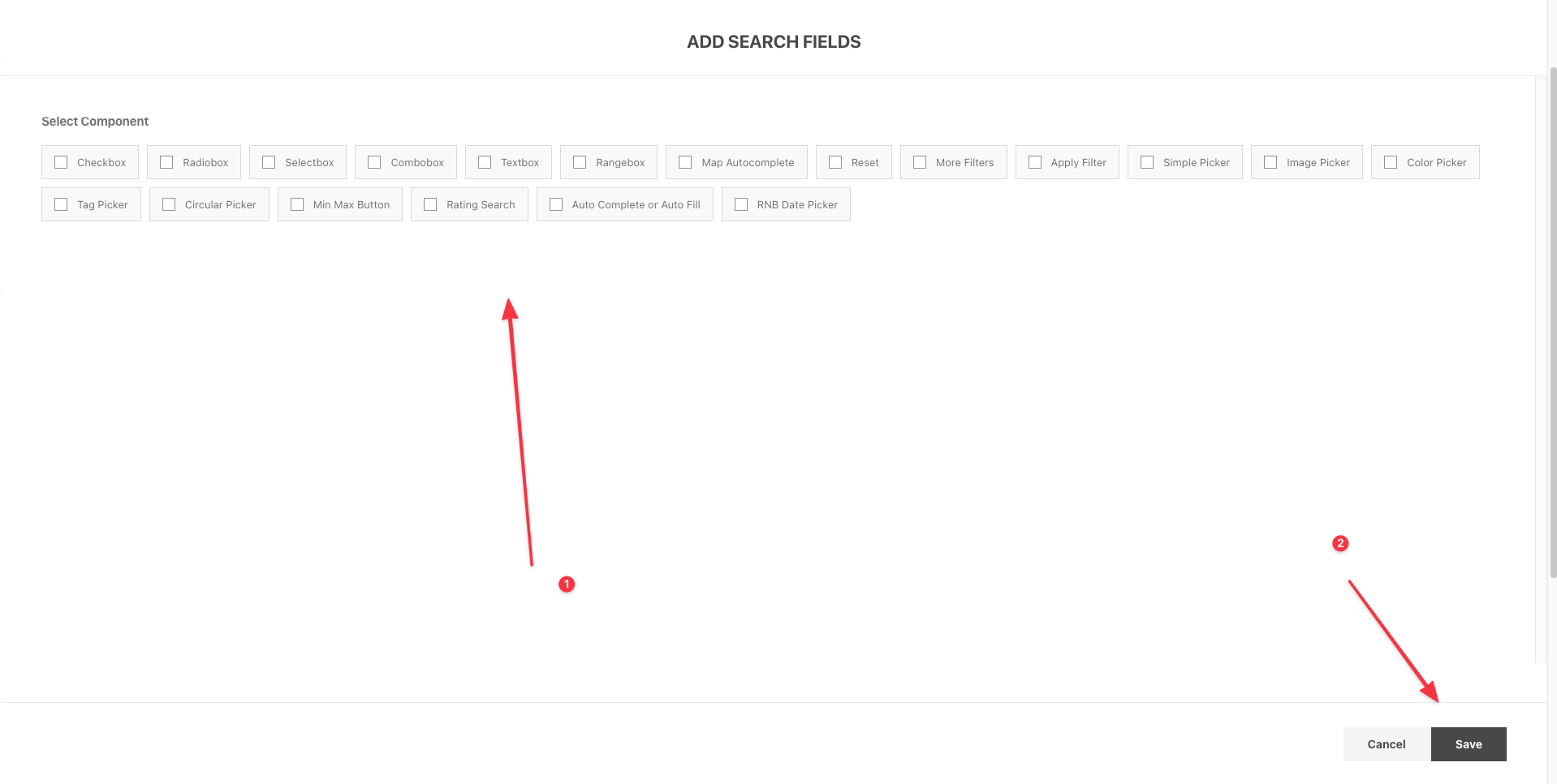
To know more about each search component and its uses please check the below sections.
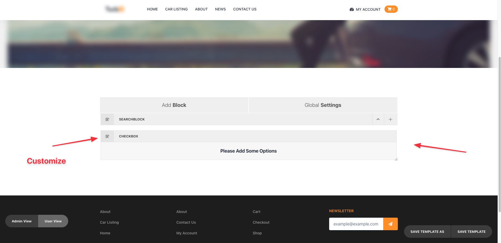
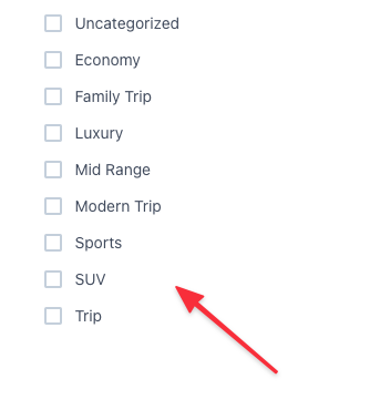
CheckBox
When you add Checkbox element to the search block initially you will see that there is Please Add Some Options message. To configure your checkbox click on the settings icon on the left corner.
You will find the checkbox panel will appear in a modal.
First you have to chose between either Metadata or Taxonomy from theData Tabin the CheckBox Panel.
The Appearance Tab can be used to change
- title- subtitle- Custom Class Name- Enter type of view- No. of options in Columns- Select Steps
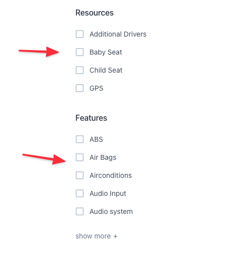
After you change necessary configuration then it will look similar to the below Snap,
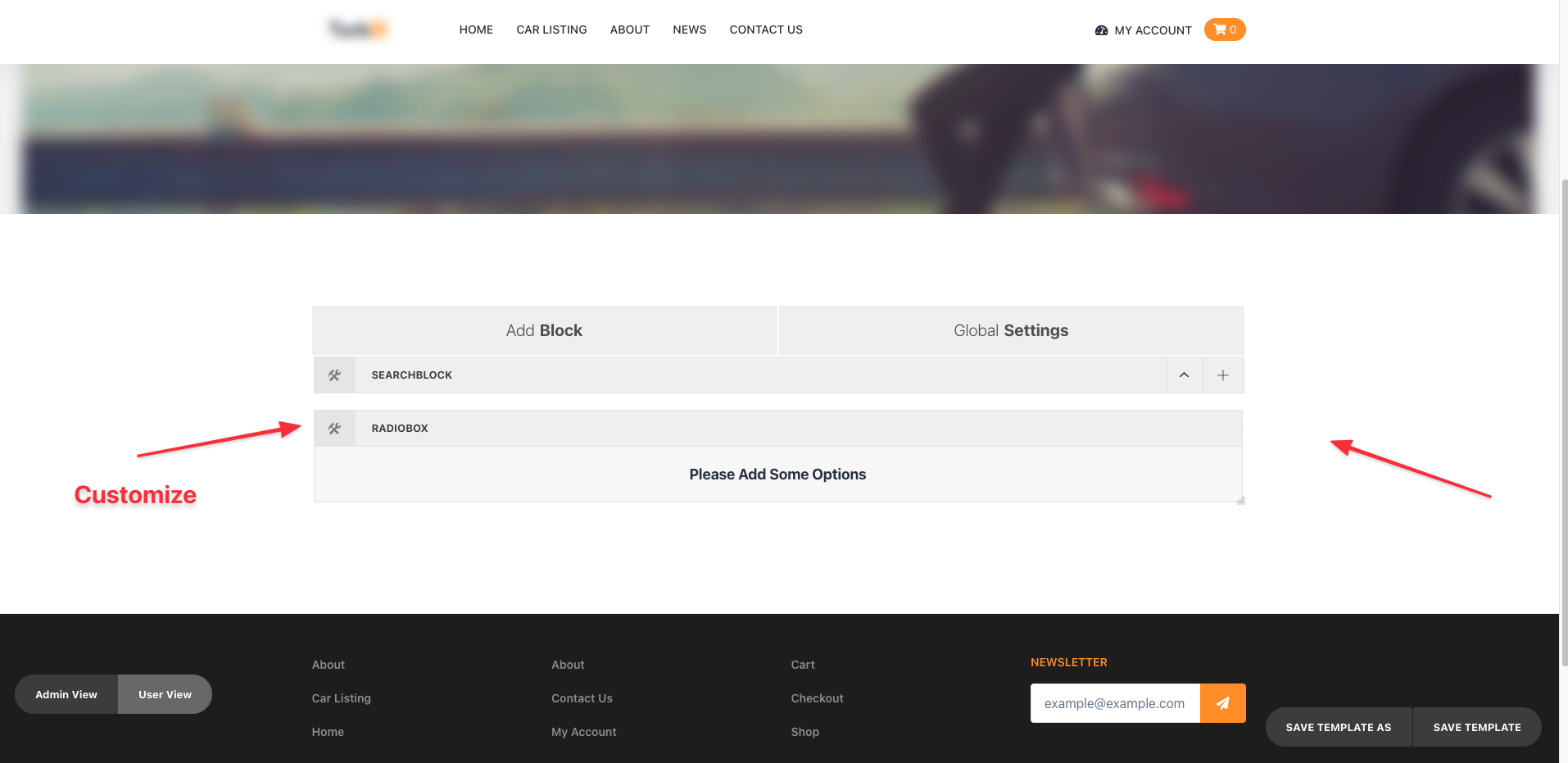
RadioBox
When you add RadioBox element to the search block initially you will see that there is Please Add Some Options message. To configure your radiobox click on the settings icon on the left corner.
You will find the radiobox panel will appear in a modal.
First you have to chose between either Metadata or Taxonomy from the Data Tab in the RadioBox Panel.
The Appearance Tab can be used to change
- title- subtitle- Custom Class Name- Enter type of view- No. of options in Columns- Select Steps
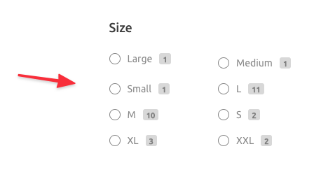
After you change necessary configuration then it will look similar to the below Snap,
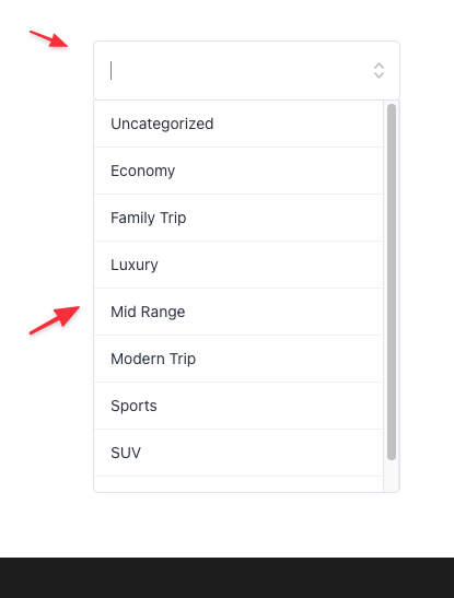
Select
When you add Select element to the search block initially you will see that there is Please Add Some Options message. To configure your Select click on the settings icon on the left corner.
You will find the Select panel will appear in a modal.
First you have to chose between either Metadata or Taxonomy from the Data Tab in the Select Panel.
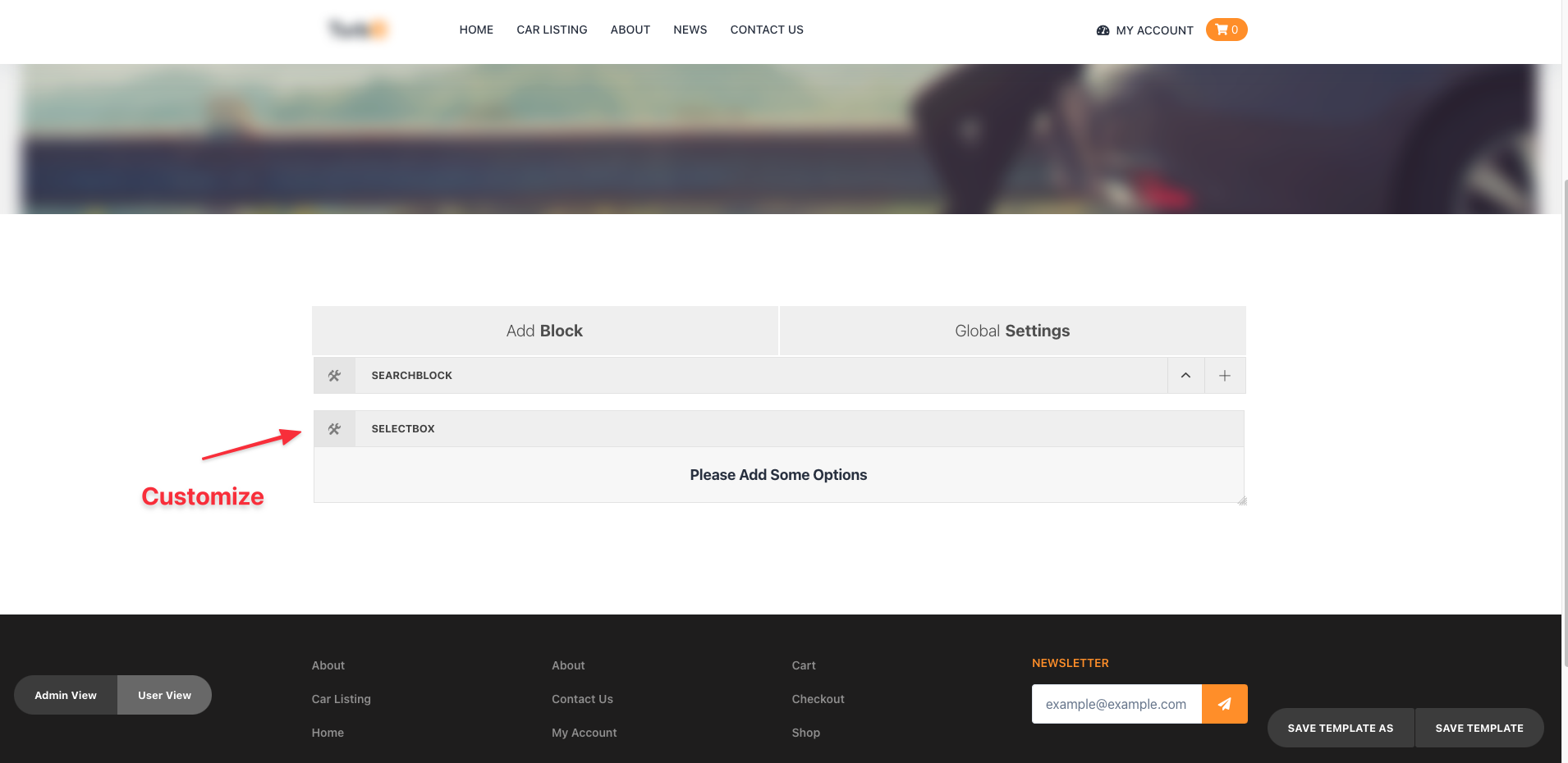
The Appearance Tabcan be used to change
- title- subtitle- Custom Class Name- Single or Multiple Switch- Enter type of view- No. of options in Columns- Select Steps
After you change necessary configuration then it will look similar to the below Snap,
ComboBox
When you add ComboBox element to the search block initially you will see that there is Please Add Some Options message. To configure your ComboBox click on the settings icon on the left corner.
You will find the ComboBox panel will appear in a modal.
First you have to chose between either Metadata or Taxonomy from the Data Tab in the ComboBox Panel.
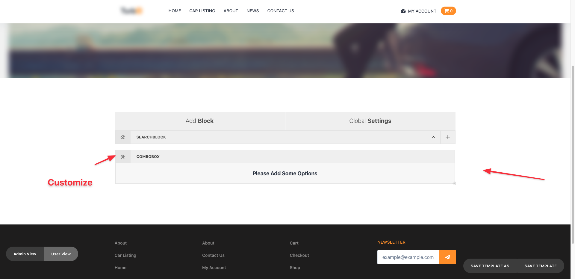
The Appearance Tabcan be used to change
- title- subtitle- Custom Class Name- Enter type of view- Select Steps
After you change necessary configuration then it will look similar to the below Snap,
Text Search
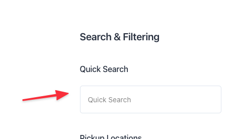
When you add Text Search element to the search block initially you will see that there is an input
You will find the Text Search panel will appear in a modal.
This can be used to change
- title- Subtitle- Custom Class Name- placeholder
After you change necessary configuration then it will look similar to the below Snap,
Rangebox
When you add Rangebox element to the search block initially you will see that there is Please Add Some Options message. To configure your Rangebox click on the settings icon on the left corner.
You will find the Rangebox panel will appear in a modal.
First you have to chose Metadata from the Data Tab in the Rangebox Panel.

The Appearance Tabcan be used to change
- title- subtitle- Custom Class Name- Enter type of view- Select Steps
After you change necessary configuration then it will look similar to the below Snap,

Location Search (Map Autocomplete)
When you add Map Autocomplete Search element to the search block initially you will see that there is an input
To surf the options you need to click the edit button.
And then You will find the Text Search panel will appear in a modal.
This can be used to change
- title- Subtitle- Custom Class Name- placeholder- Search Range Radius(In KM)- Disable Dropdown Toggle(Applicable if the Search block is in Dropdown Mood)
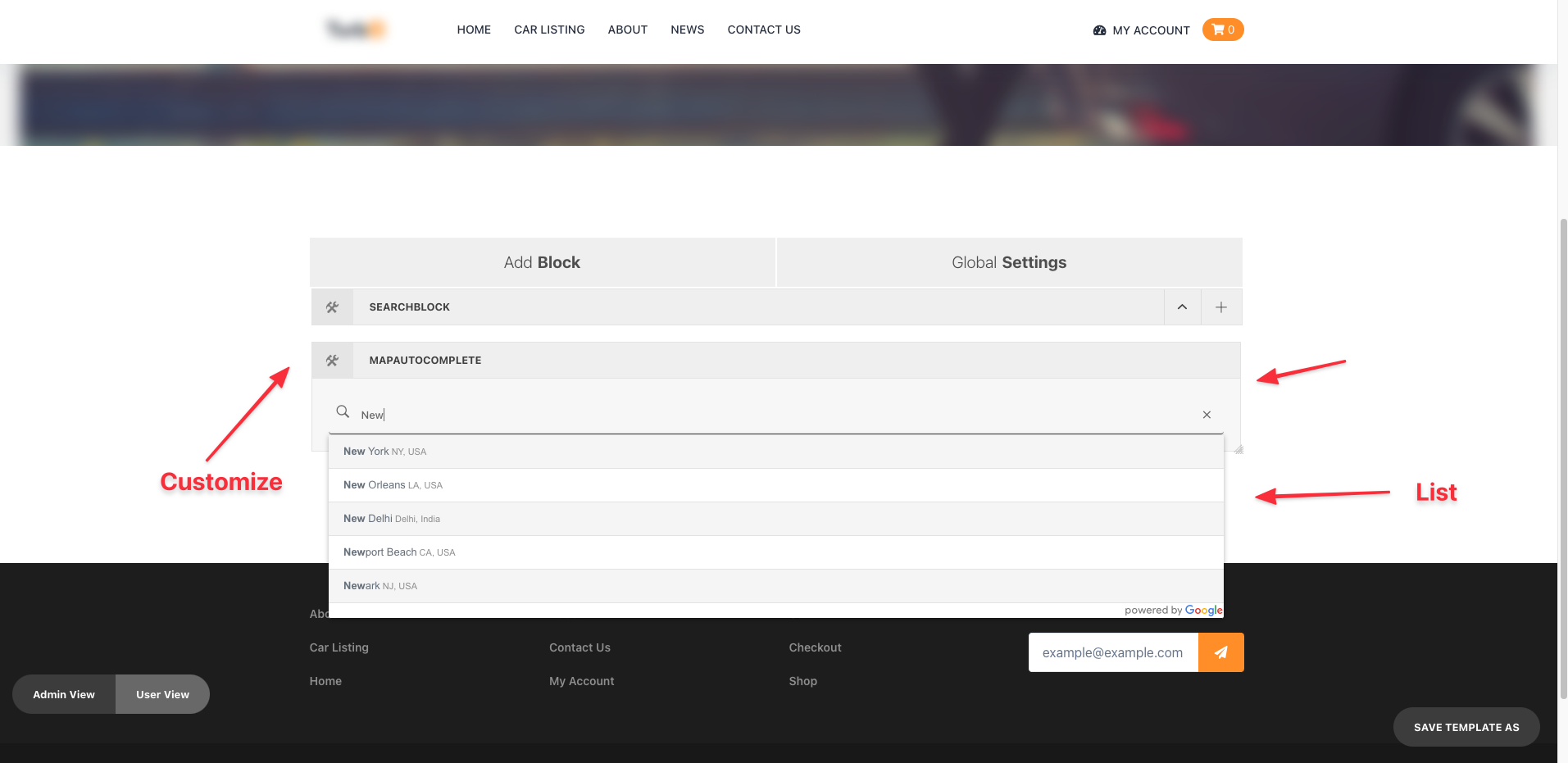
NB. You need to Provide the Google Map API key
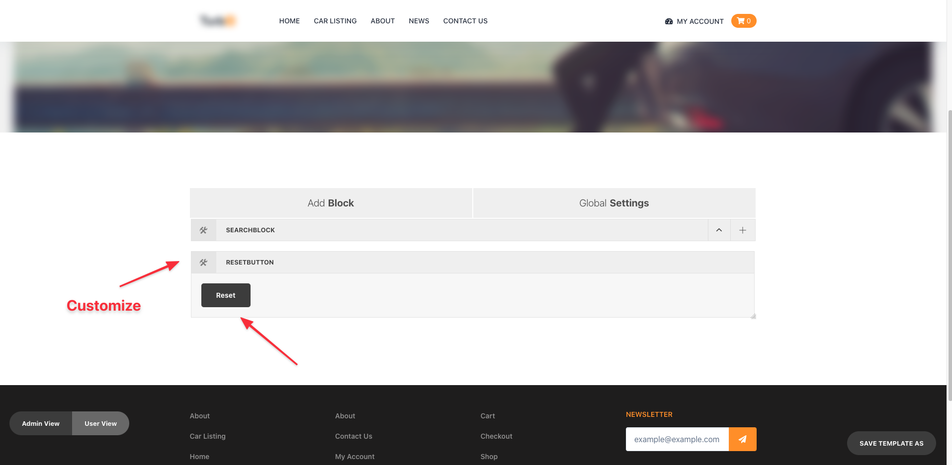
Reset
When you add Reset element to the search block initially you will see that there is a button
You will find the Reset panel will appear in a modal.
This can be used to change
titleCustom Class Name
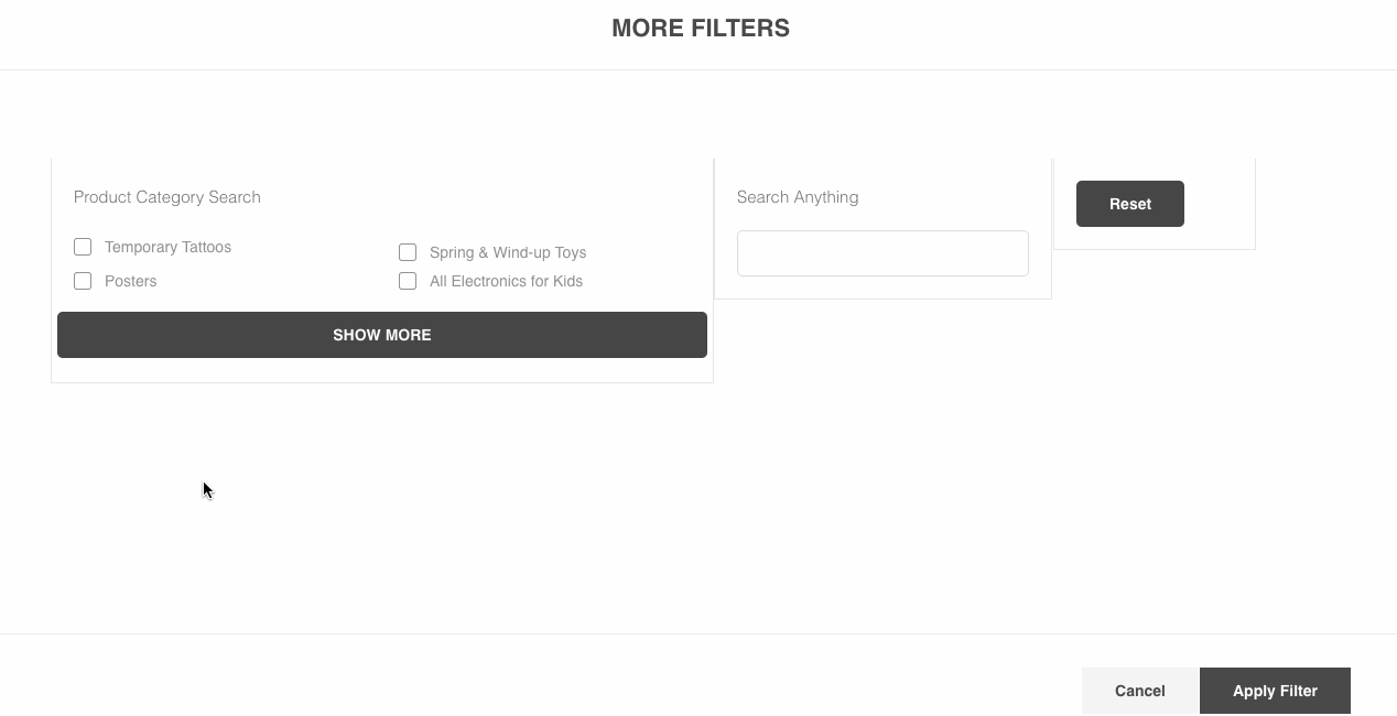
Apply Filter
When you Try to search all on a button Click You should use Apply Filter Search Element.
When you Apply Filter element to the search block initially you will see a black button.
You will find the Apply panel will appear in a modal.
The Appearance Tab can be used to change
- title- subtitle- Custom Class Name- Enter type of view- Select Steps
After you change necessary configuration then it will look similar to the below Snap,
More Filter
Sometimes you want to make a Search Block visible on a modal and control that modal based on a button just like the following gif.
Then you should use More Filter Search Element.
Add A Search Block first (which you want to show on the modal) from the Add Block Part. On Each Search Block edit option you will find a Toggle Button named Place In Other Search Block
This will Make the Search Block Hide on the corresponding position in the User view.
Now take A More Filter Search Element. On the Edit Panel The list of Search Block that is configured as Place In Other Search Block will appear and You have to select which search Block You want to show on the modal.
Everything Remains same to build the Search Block from the Admin panel. After building that On the User view Clicking on the More Filter button, the configured Search Block will open.
First you have to chose between either Metadata or Taxonomy from the Data Tab in the Filter Panel.
The Appearance Tabcan be used to change
- title- subtitle- Custom Class Name
After you change necessary configuration then it will look similar to the below Snap,
NB. Please Try to place the Target Search Block At the End of the Page.
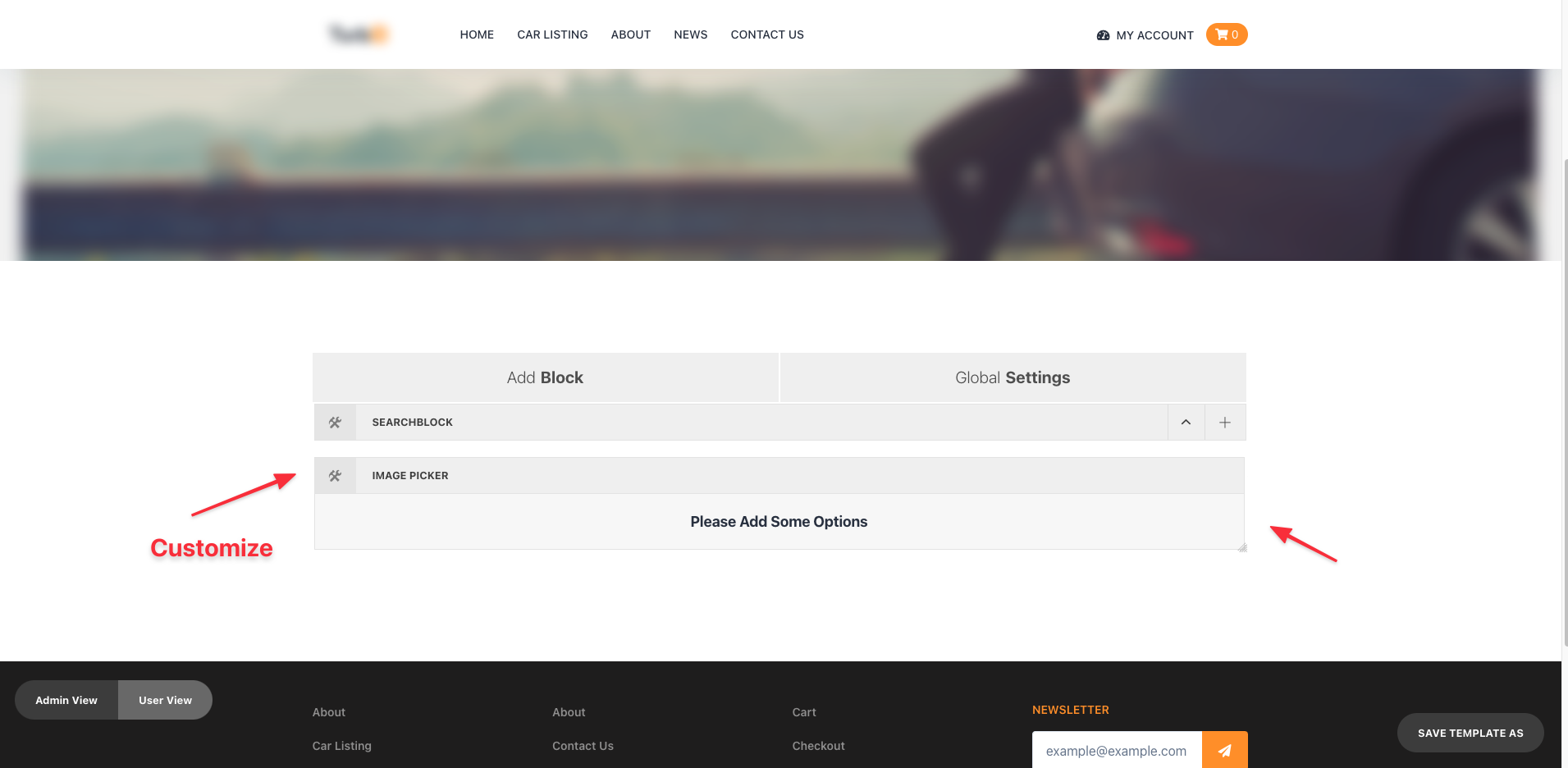
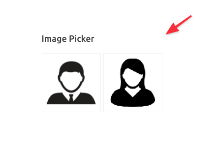
Image Picker
When you add Simple Picker element to the search block initially you will see that there is Please Add Some Options message. To configure your Simple Picker click on the settings icon on the left corner.
First you have to chose between either Metadata from the Data Tab in the ComboBox Panel.
The Appearance Tabcan be used to change
- title- subtitle- Custom Class Name- Enter type of view- Select Steps
After you change necessary configuration then it will look similar to the below Snap,
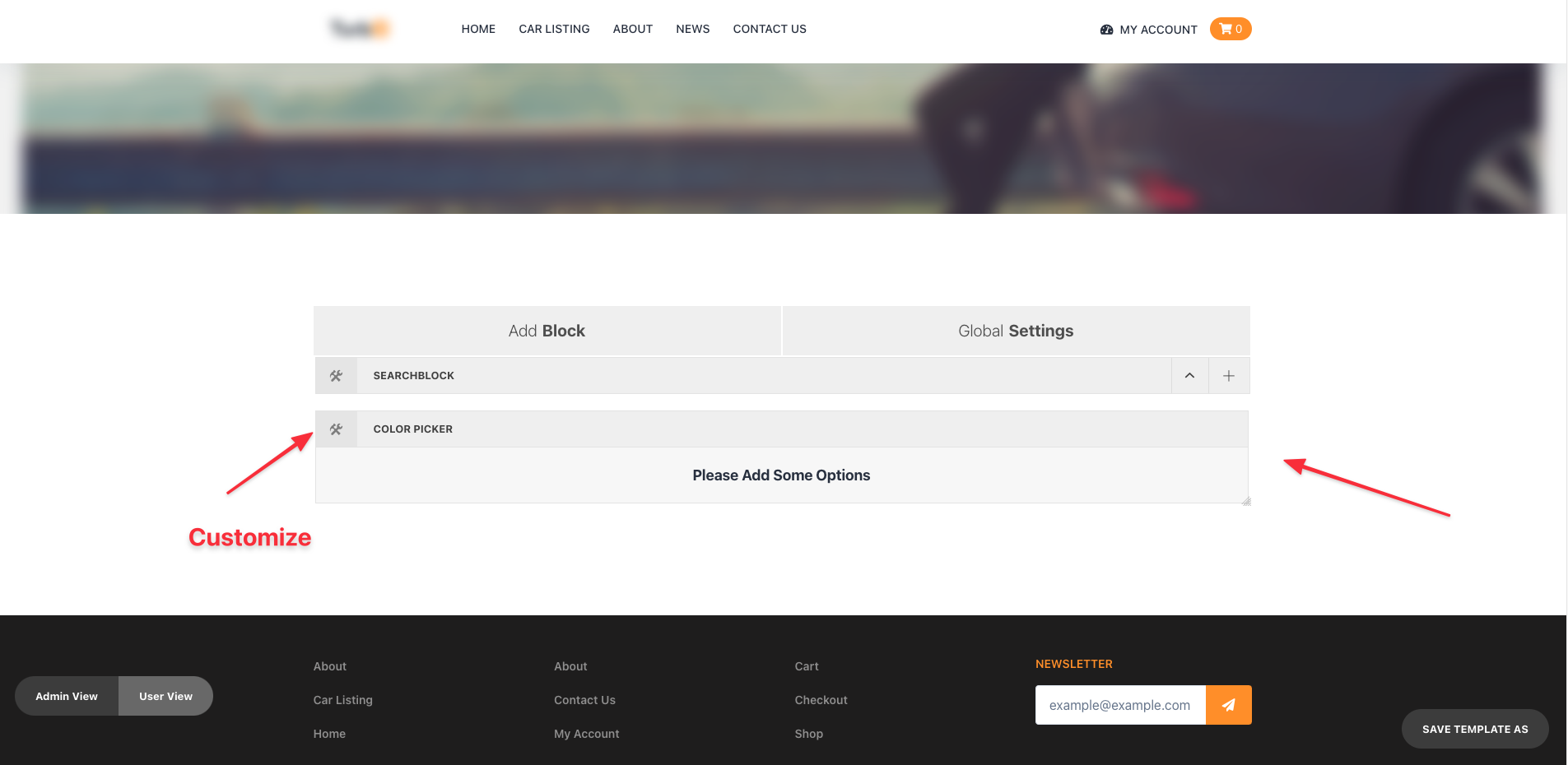
Color Picker
When you add Color Picker element to the search block initially you will see that there is Please Add Some Options message. To configure your Simple Picker click on the settings icon on the left corner.
You will find the Color Picker panel will appear in a modal. First you have to chose between either Metadata from the Data Tab in the Color Picker Panel.
The Appearance Tabcan be used to change
- title- subtitle- Custom Class Name- Enter type of view- Select Steps
After you change necessary configuration then it will look similar to the below Snap,

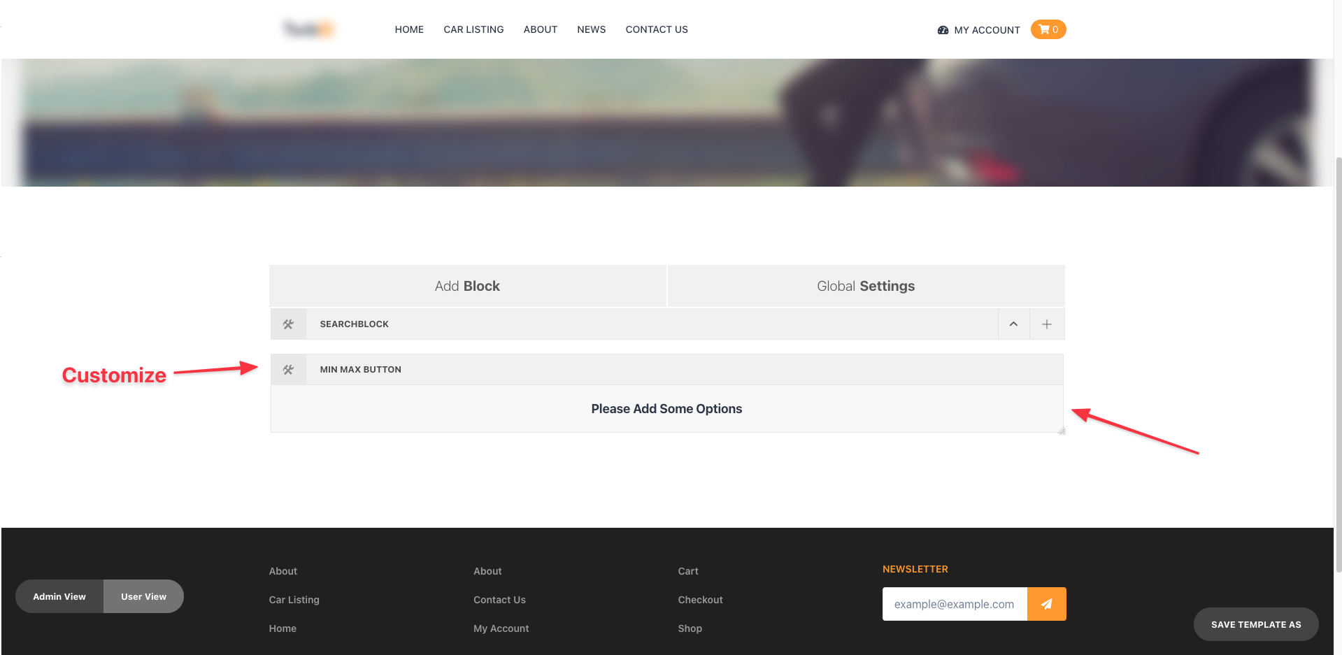
MinMax Button
When you add MinMax Button element to the search block initially you will see that there is Please Add Some Options message. To configure your MinMax Button click on the settings icon on the left corner.
You will find the MinMax Button panel will appear in a modal.
First you have to chose between either Metadata from the Data Tab in the MinMax Button Panel.
The Appearance Tabcan be used to change
- title- subtitle- Custom Class Name- Enter type of view- Select Steps
After you change necessary configuration then it will look similar to the below Snap,